Hannah Liddle
|
Artist Statement
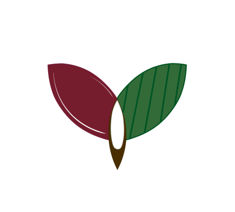
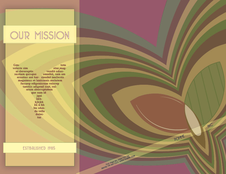
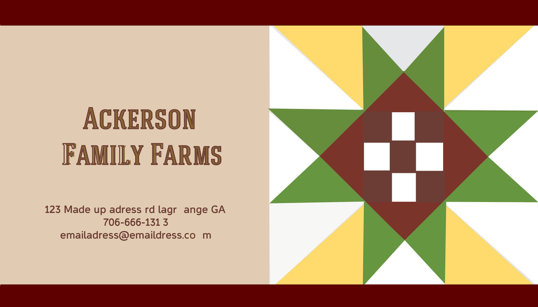
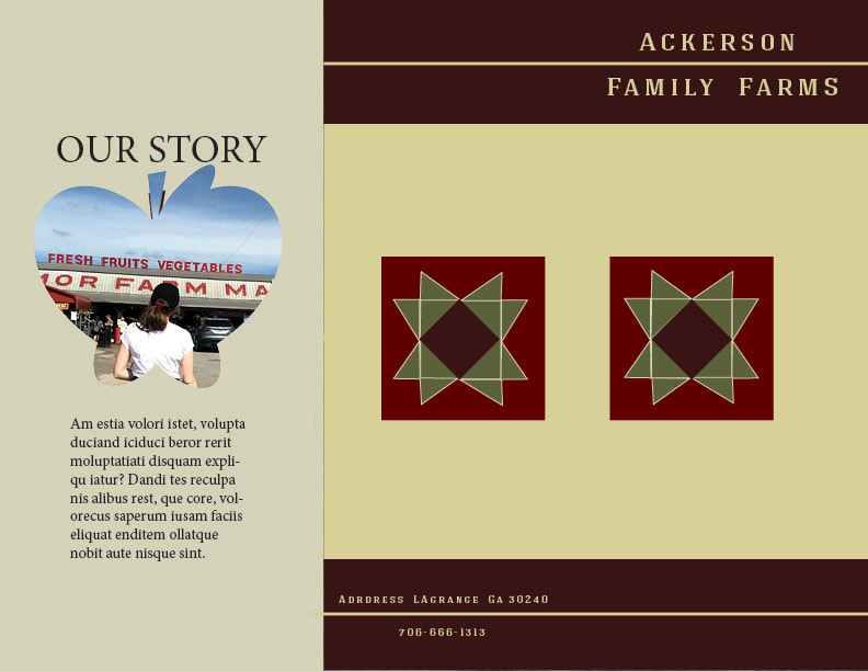
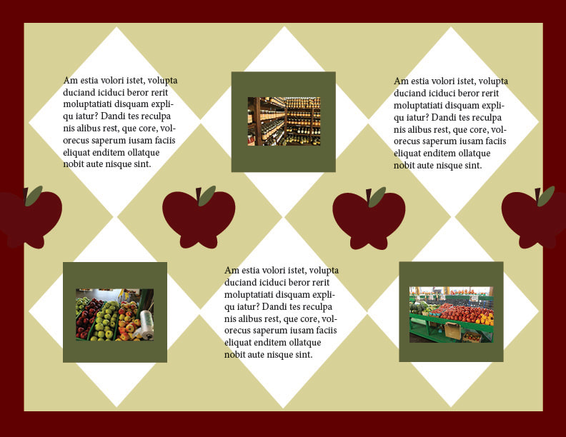
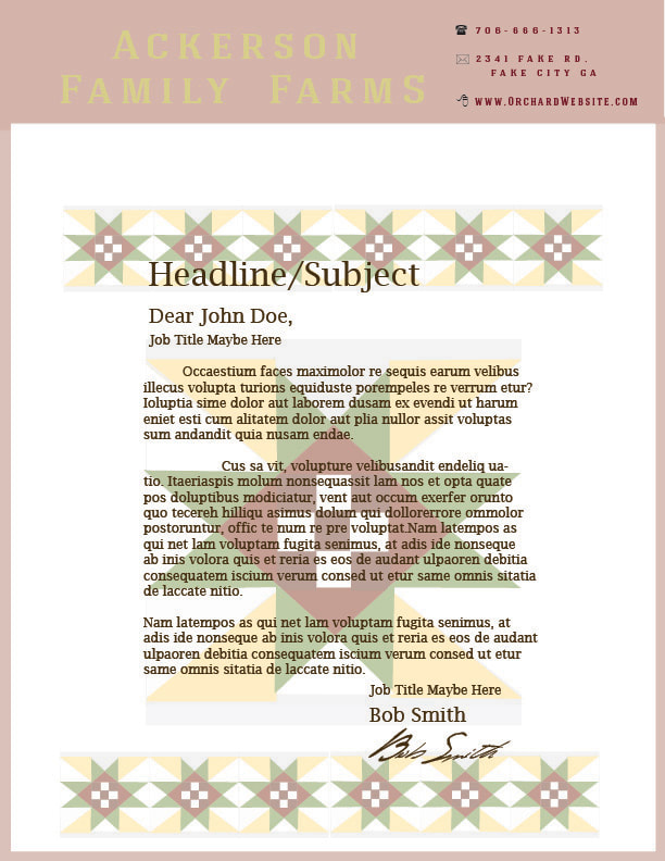
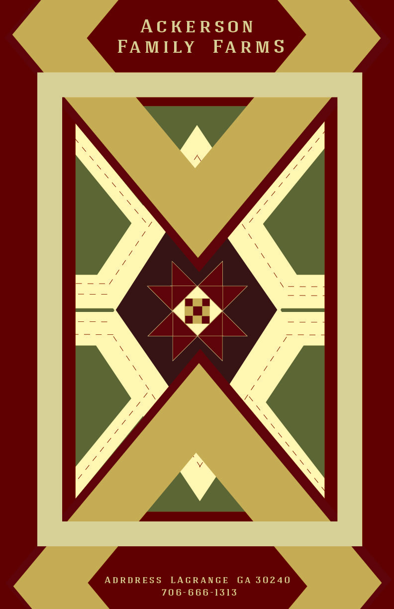
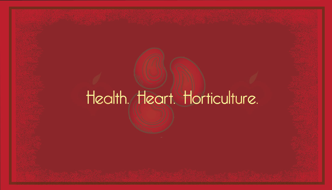
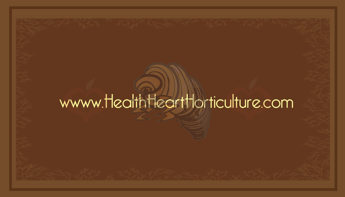
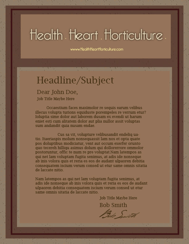
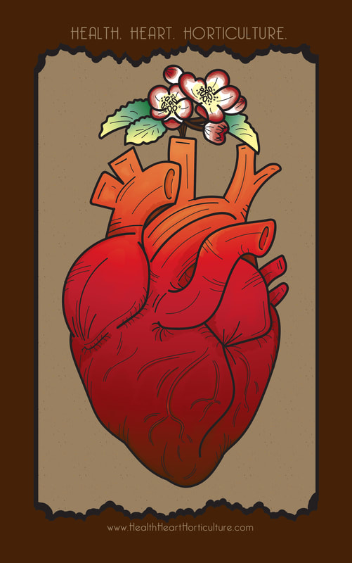
As a double concentration in Animation and Graphic Design I have produced a Senior Exhibition that displays proficiency in both disciplines, while still possessing a unifying visual theme that is more graphic in nature. In order to produce a body of work exemplifying these multidisciplinary qualities I have created branding projects for three separate mock properties, each with a distinctive identity. The three identities consist of a corporate identity, a large business that sells apple-based products, a small business identity, a family orchard, and lastly an informational/scholastic identity, an apple based health campaign.
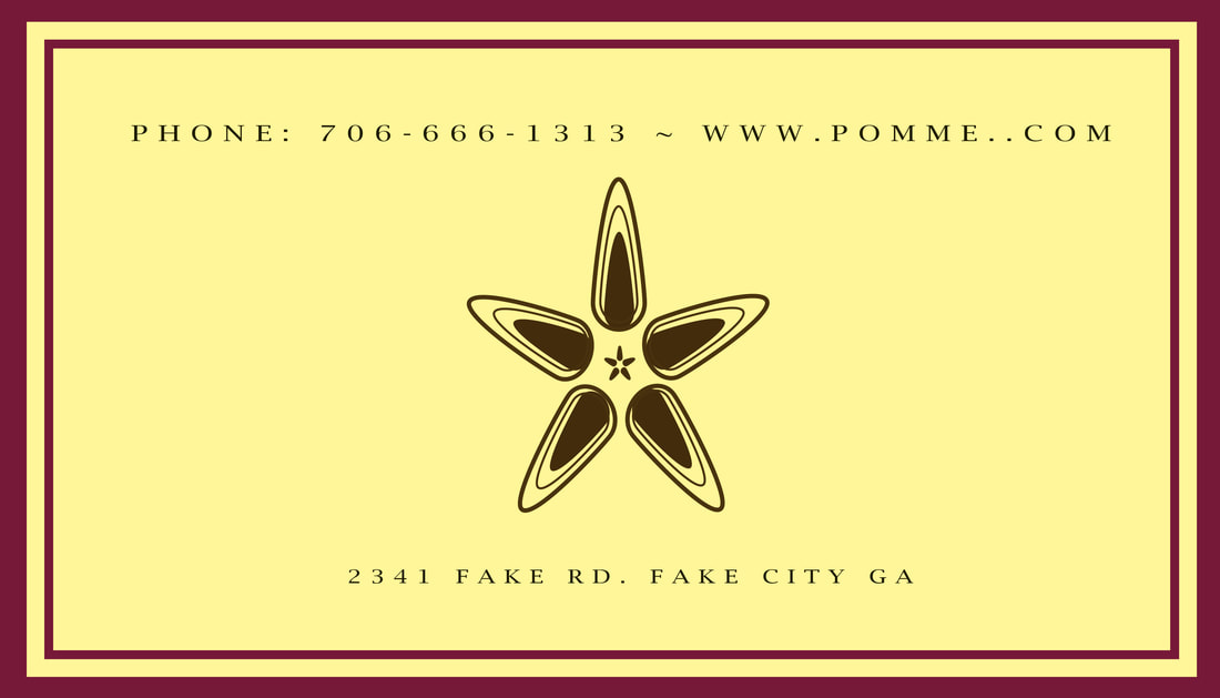
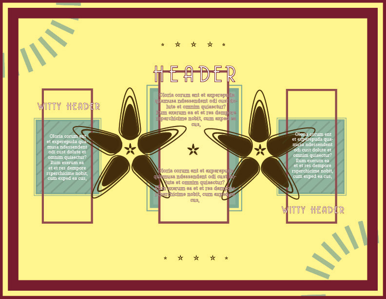
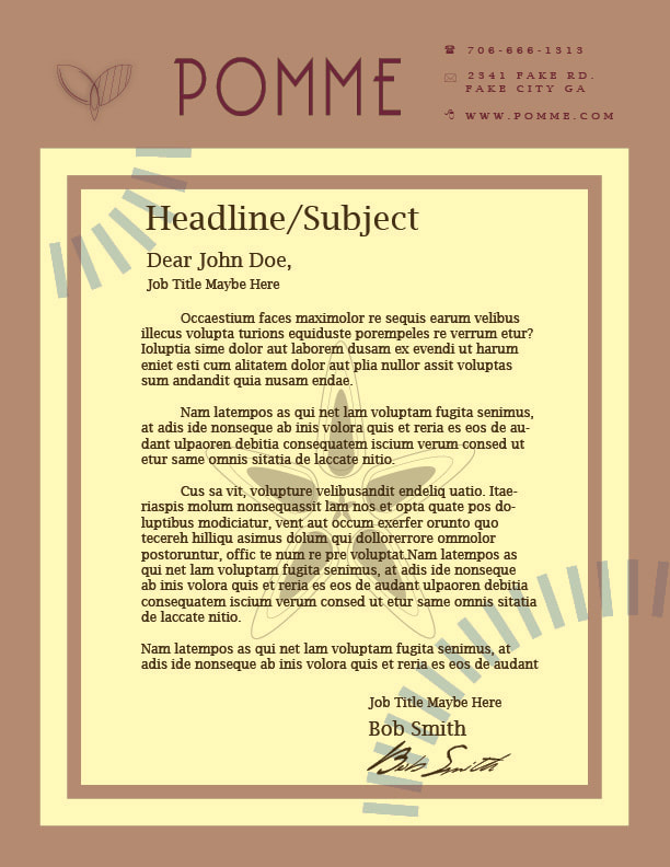
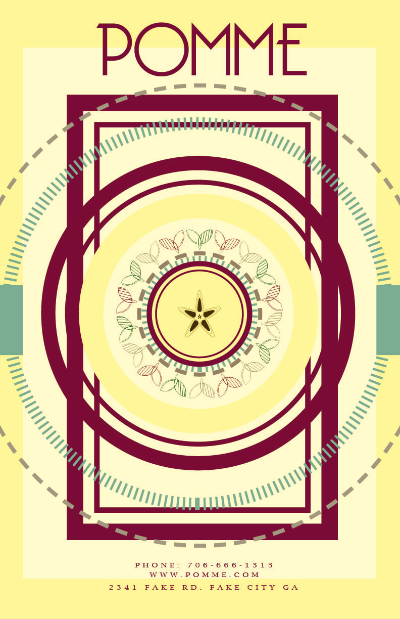
Each branding package includes: Poster Animated Web Icon based upon the primary logo Logo Design Pamphlet Letterhead Business Card By choosing a fairly common and simplistic item such as an apple as the base inspiration for these three mock identities, I am exploring the ways in which the employment of various differing design principles and aesthetic choices can produce three visually unique and distinct properties. The Orchard Identity relies more heavily on a combination of both fills and outlines to communicate a less formal more playful but still graphic and simplified visual tone. In contrast, the Corporate Identity uses solid fills less often, relying instead upon outlines and the manipulation of fills with semi transparent opacities to create a more formal yet still dynamic visual tone. Lastly the apple based Health Campaign Identity, being more scholastic and educational in nature, is far more illustrative in nature in order to establish a less formal, more playful and entertaining tone. However, despite these intentionally distinctive visual tones I intentionally limited the color scheme in order to create a more visually cohesive Exhibition that would be more easily processed by an audience. As such, in order to produce a cohesive show I relied heavily on adhering largely to this limited color palette, while using bold shapes and colors throughout. By utilizing these shapes and colors I intentionally aimed to create a geometric yet dynamic design for each identity while remaining visually engaging. |
|